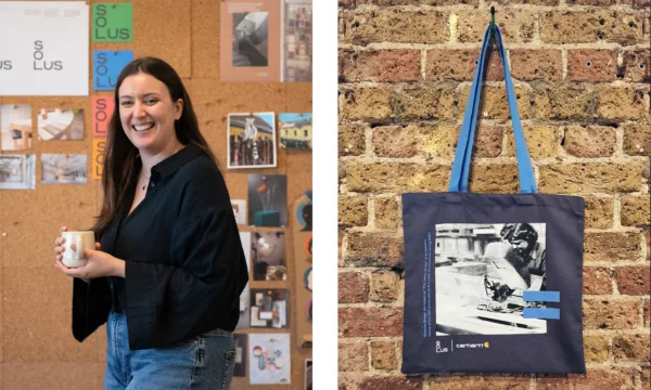
Lara-Jane van Antwerpen on the visual identity for Empowerment of Women in Construction and Architecture
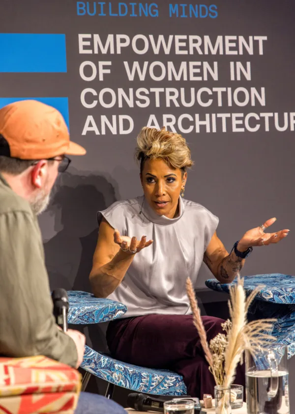
Last week, we hosted Building Minds: Empowerment of Women in Construction and Architecture.
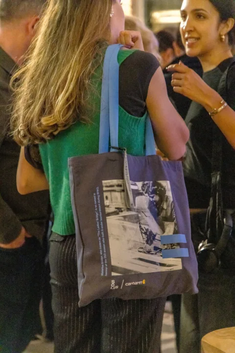
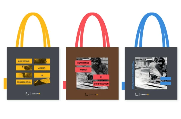
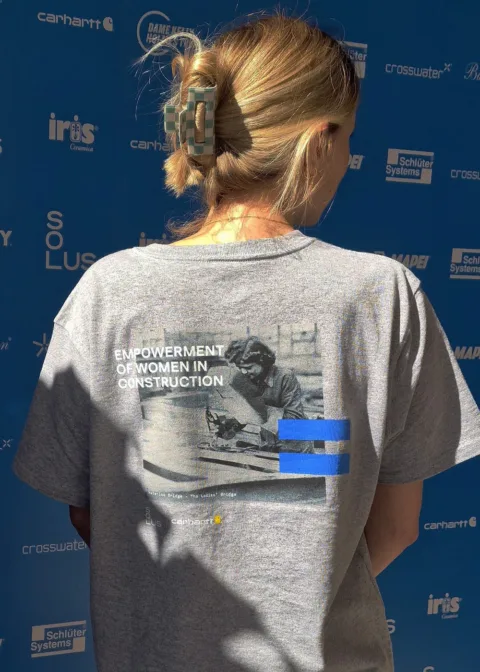
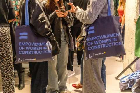
As part of the initiative, our talented Senior Graphic Designer, Lara-Jane van Antwerpen, developed the visual identity and branding for the event. This was brought to life on the invites and within the space. We also had the opportunity to collaborate with Carhartt, releasing a tote bag and t-shirt for guests.
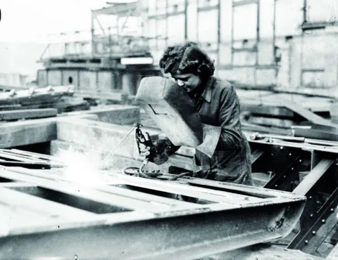
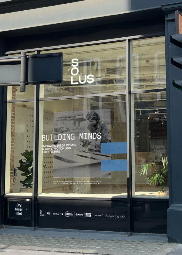
The branding tells the story of Waterloo Bridge, nicknamed ‘The Ladies’ Bridge’ as it was built by 350 women during World War II. The women were almost erased from history, with the then-deputy Prime Minister Herbert Morrison failing to acknowledge their vital role. At the launch event, Morrison declared, “The men who built Waterloo Bridge are fortunate men. They know that although their names may be forgotten, their work will be a pride and use to London for many generations to come.” It wasn’t until 2005 that the women were finally officially recognised for their contribution, thanks to Christine Wall.
We spoke to with Lara-Jane about the visual identity and the creative process behind developing it.
Conleth
Tell us a bit about the event: what is the purpose and how did it come about?
Lara-Jane
At Solus, ‘People, Product Planet’ are central to how we operate, and guide us in our decision making. Building Minds came from our focus on people. It’s a way to highlight social issues within the construction and A&D community. It’s a chance to come together to bring awareness and to speak about how we can help tackle these issues as a community.
This year’s Building Minds, ‘Empowerment of Women in Construction and Architecture’, gave us the opportunity to talk about all the great things women have done, in what is heavily viewed as a male dominant line of work, as well as the challenges they’ve faced, and how they’ve overcome them. We hope this will inspire women who are working within the industry, or thinking of getting into it, as well as giving actionable points for both men and women within the industry to take away and implement.
Conleth
How do you go about developing a visual identity for an event? Is there a shared aesthetic between you and the rest of the team?
Lara-Jane
Our Creative Director, Sam Frith, approached me to head the branding for this year’s Building Minds. We both share an affinity for collage-style artwork, a bold and simplistic Bauhaus style and (at least on my side) a bit of a punk rock Jamie Ried-style art. What’s more punk and 'anti-establishment' than a woman choosing to work in construction?
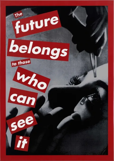
He sent me work from Barbara Kruger. Her work uses black and white photography, bold imagery, and text with a signature colour. We felt this style fits well with our branding, but also is a style often used to shout political statements. Easy to read, bold and memorable.
Conleth
Tell us about the process for developing the visual identity. What ideas did not make the cut? Which elements are you happiest with?
Lara-Jane
A basic outline of the process for these kinds of projects is, we get an initial idea, the graphics team scurry away and come up with loads of rough ideas, then we have group meetings and discuss different pathways to take, and eventually, we land on the final idea.
This wasn’t much different to the norm. After my meeting with Sam, I went away with lots of ideas in my head. The main ones were a bold aesthetic. Sam had this great idea of a returning motif; we discussed using an equal’s sign to symbolise equality. I also wanted the artwork to be educational, to teach people an example of something great women have done, something for women to celebrate like “hey, did you know this is an image of a building only built by women!”
But to do that I had to educate myself first! I started googling famous female architects and construction figures from history. I started collecting images and making collages of female architects from different eras, before deciding it was simpler to focus on one person – less is always more.
For the first concept, I initially focused on Louise Blanchard Bethune, often referred to as the first known female architect. I chose yellow as my colour (bold, fun, gender neutral), carrying on the Equals symbol motif. While we liked the message, we felt like the story could be stronger. Katie Mitchelmore, our Brand Manager, had the great idea of the Waterloo Bridge, nicknamed the Ladies’ Bridge because it was built by 350 women in WW2. I found an amazing image of a lady referred to as Dorothy welding the Waterloo Bridge. It was when this photo was unearthed, along with three others, that helped prove women had in fact played a huge role in the construction of the bridge.
And then the biggest decision of all... the colour…To pink or not to pink? That was the question! We wanted the bold colour pop to be linked to our branding. We have lots of great choices, one being pink. But was pink too obvious? Was it fun or was it patronising? After many meetings and artwork iterations, we landed on our blue and grey branding. Blue, these days, is often considered a ‘masculine’ colour, and we liked the juxtaposition play on that. I also liked the link of the blue and grey overalls that women wore to work in during the war.
The on the grid off the grid style was my way of nodding towards the punk aesthetic but still keeping it tidy and easy to look at. A singular bold equals sign to drive home to purpose of the event and a subtle line telling you the story or the Ladies’ bridge.
Conleth
How did you get into graphic design? Tell us a bit about your career.
Lara-Jane
I grew up with Dyslexia when It wasn’t really known about. When I was at school, I tended to excel in class but not in tests, so I was placed in pretty low sets and ended up doing after school classes to match my real abilities. I found I excelled in more artistic classes, (drama, art textiles) and I had a weird draw to business studies - I liked the idea of studying consumers and the concept of a brand. I was going through my early 2000s emo phase and used to spend all my nights ignoring homework to edit my Myspace page.
When I got to break free from high school, I had no idea what I could do, so I decided on a creative mix. I knew I liked the being on the computer, so I took up Graphic Design. Then I was like “god, what skills do I need for that??” So, I did photography and media studies alongside it. I quickly left for a Graphic Design B-tech course instead. From here, I went to university, where I learnt there are three types of graphic job. Freelance, agency and inhouse. I prefer the security of inhouse working, I like getting to know a brand and the challenges of being creative within the limits of a brand identity.
I got my job at Solus way back in 2016 as a Junior Graphic Designer. I’ve learnt so much since being here and being part of all the different phases of the company. There’s so much more than just tiles and I love the exciting projects I get to be part of.
NEWSLETTER
Get the latest news and updates sent straight to your inbox.


Meet the team: Domhnall McLaughlin
10th Jun 2026


Meet the team: Jade Whiteside
24th Apr 2026

Hearing the Eyes of the Skin
23rd Mar 2026

Under the Table with Glenn Howells
16th Jan 2026

Solus celebrates 30 years
11th Dec 2025

Under the Table with Ian Simpson of SimpsonHaugh
22nd Oct 2025


Meet the team: Luke Bajic, Specialist Product Consultant
29th Sept 2025


Under the Table with Simon Allford
29th May 2025


Staples: What's on this Clerkenwell Design Week
23rd Apr 2025


Meet the team: Aaron Taylor, London Area Sales Manager
30th Jan 2025

Meet the team: Lauren Riley, London Area Sales Manager
29th Jan 2025


Goodbye to 2024
17th Dec 2024


Earth: Elements by Florim and Stiff + Trevillion
18th Nov 2024


Clerkenwell Design Week 2024 – The Aftermath
30th May 2024

What’s on this Clerkenwell Design Week 2024
23rd Apr 2024

The story of the Ceramophone
23rd Feb 2024

Building Minds: In conversation with Frank Bruno
17th Jan 2024


In conversation with Juhani Pallasmaa
2nd Nov 2023


Solus Clerkenwell reopens its doors
31st Jul 2023

In conversation with Roger Tyrrell
21st Jun 2023

How can design drive optimism and change?
15th Jun 2023

Clerkenwell Design Week 2023
31st May 2023

What’s on this Clerkenwell Design Week 2023
24th Apr 2023

In conversation with Mauro Mazzi, CEO of Mirage
17th Apr 2023


How do materials shape positive experiences?
6th Oct 2022


How can the design industry lead with purpose?
13th Jul 2022

Solus sponsors Birmingham charity walkathon
7th Jul 2022

Meet Ken Graham, Sustainability Manager
23rd May 2022

Artisanal ceramics take centre stage for CDW Unlocked
22nd Jun 2021

Solus celebrates 25 years
16th Mar 2020
