How can design drive optimism and change?
How can design drive change? How can design generate optimism? Graphic Artist Anthony Burrill, Colour Consultant Justine Fox, and Activist Architect Robert Delius discussed these questions within the context of their work at the Solus Clerkenwell recently.
The panel
Anthony Burrill
Graphic Artist
Justine Fox
Colour Specialist
Robert Delius
Architect and Head of Sustainable Design, Stride Treglown
THE TALK
The panel discusses the question with PR Executive, Conleth Buckley.
Conleth
How can design drive optimism and change?
Anthony
We all desire change and optimism in our lives and we can achieve that with the people with whom we spend our time. The significant part of being human, for me, is within these daily social interactions. My work is about connecting my personality with everyone’s experience, with the work as a bridge between the two. I’m a naturally optimistic person – some would say annoyingly so – and it comes through in my work and, hopefully, connects with people.
Robert
The MP for Brighton, Caroline Lucas has written on her social media, “A better world is possible; let’s make it happen.” I thought that was a neat way to think about how design can influence positively. The words “a better world” force us to imagine what that could be and what it is now; “is possible” is a strong expression of belief that our actions can make a difference; “let’s make it happen” emphasises the need for collaboration and the need for action rather than passivity. I think that’s the role we have as designers; the very act of making and doing is a positive thing which can inspire people.
Justine
I remember my dad telling me when I was studying, “Justine, there’s no great mystery about design: design is about problem solving.” As designers, we’re naturally optimistic and attracted to this process. As a colour designer, I often plug into other people’s designs. I was recently collaborating with June Mineyama Smithson who is famous for her use of vibrant colour. We began to explore if people arrive at optimism the same way, if there are universal ways to induce that kind of dopamine, and how we might work with that. We eventually went with a quite a pared down palette based upon our investigation. This sharing of ideas is as central to design as optimism.
Anthony
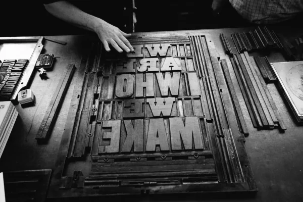
Anthony, much of your work is typographic. Why did you choose typography as a form of artistic expression?
Anthony
I’ve always been drawn to words. I’m super-geeky about type but just as interested in how words affect people. At school I was good at English, Art, and Geography. I think something in the process of drawing geographical diagrams (you know, glaciation, U-shaped valleys) really struck me. Figuring out how to represent complex interactions or ideas visually has always appealed.
Conleth
And do you have a favourite and least favourite letter?
Anthony
I primarily work with historic typefaces, most of which were designed over a hundred years ago. I have designed four or five typefaces using grid systems, and Q is always the one that knocks everything out. You’re doing a nice E or a nice F and it’s all working well. Then you come to Q and it’s like, for fuck’s sake! I think A and Z are nice letters, obviously I like A because it’s my first initial, and Z because it’s super-dynamic.
"In all fields of life, we’re influencing all the time even if we may not be conscious of doing so."
Conleth
Rob, you’ve been called an activist Architect. How do you feel about that label?
Rob
I think we’re all activists. In our work we make a difference, whether that’s good or bad. In all fields of life, we’re influencing all the time even if we may not be conscious of doing so. I’m very fortunate, as an architect, that in the work we do we can have a huge influence on peoples’ lives in terms of creating places. Most of our work is at scale, so we can affect the shape and feel of whole neighbourhoods. We use our position to influence our clients (sometimes stealthily!) to make positive design choices.
Conleth
Is there a conflict between commercial interests and advocating sustainability?
Rob
I think there has been but that’s changing. Commercial clients are realising that reputation is important. We’re turning away work, as a practice, that we might have taken on 10 years ago, because we don’t want to work with that client anymore or on that kind of project. Because we’re big we can have an influence on our suppliers and work with those that share our values.
Conleth
Justine, could you explain your work in a bit more depth?
Justine
My purpose is to challenge ideas around colour. I promote discernment and thoughtfulness around the use of colour in design and particularly the built environment. Firstly, I ask, what is colour? To many, it is an aesthetic, but that’s just one aspect of it. Colour is an energetic function that is as real as gamma rays, microwaves, radio waves and x-rays, and so it is important that we consider how we work with it.
Conleth
How does colour consultation connect to communities and activism?
Justine
Colour for activism is not a new thing. If we consider the journey of pink, we can see the significance and power of colour. Pink was a colour for little boys that switched to girls in the early part of the last century. During the Holocaust it was used as an identifying marker by fascists for homosexual men. The pink triangle, intended as a badge of shame, was then reclaimed in the 1970s by gay activists. Recently pink was adopted by women’s rights activists in the USA to protest the misogyny of Donald Trump. That it represents the colour of scar tissue is a powerful idea contained in the colour itself and perhaps partly explains its adoption by marginalised groups. If we look at the work of Adam Nathaniel Furman, who declared the New London Fabulousness, their use of colour is about visibility. Being seen in your community where you had previously not been seen. So, in many cases, colour is about identity.
Conleth
How do you manage the cultural implications of colour in diverse communities?
Justine
There’s a distinction to be made here between colour symbolism and colour psychology. The former is a learned response that can be shaped by culture, and the latter is our universal instinctive response to colour. In terms of planning, much of our environment is coloured by historical precedents and doesn’t reflect either the communities that live there now, nor the communities that will be there in the future. I think it’s important to consider both the cultural and psychological components of colour in dialogue with a community as we build new places.
"Everyone is searching for meaning in life. If you see something that connects in a way that makes sense to you, then that can be powerful."
Conleth
Anthony, your work is predominantly black and white, is there a reason for that?
Anthony
I like the high contrast nature of it and it’s cheaper to print. When I was a student I did a lot of my work on a photocopier black ink on white paper – and that was the essence of the design. The day I worked out how to put coloured paper through the photocopier was a huge thing! Whenever I use colour it’s a purposeful decision and I often go for tonal relationships like red on pink or blue on light blue. Black and white for impact and strength. Colour for me is another decision to make and I’m all about getting rid of decisions, getting to the nub, the essence of what it is I’m trying to say.
"It was a journey marked by relentless optimism, where every step we took was like crossing another bridge, and eventually, we surprised ourselves by making it happen."
Conleth
What kind of reactions do people have to your work?
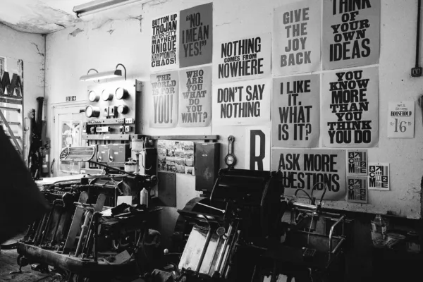
Anthony
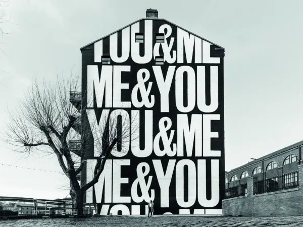
I think any artist or musician would say they’re making the work for themselves. So, it’s a message from myself to myself “Give the joy back. Work hard and be nice to people.” They’re positive affirmations and anchoring phrases. Everyone is searching for meaning in life. If you see something that connects in a way that makes sense to you, then that can be powerful. With the advent of social media, you can see if a print has landed with people. ‘Work hard and be nice to people’ was the first one that crossed over from the world of graphic design to a wider audience at that time. During lockdown I worked on, ‘You & Me & Me & You’, a piece that emphasises community, connection, and togetherness. You have to work with the world that you see in front of you, the changing world, then hopefully that work connects with people.
Conleth
Is that where you get your ideas from?
Anthony
Yeah. I was in a supermarket in Clapham at the checkout behind an older lady who was chatting with the assistant, and she said, “The secret to a happy life is to work hard and be nice to people.” It just floated in the air, and I had my butterfly net at the ready and I thought, “I’m having that!”. That was the first work I produced with Adams of Rye.
Conleth
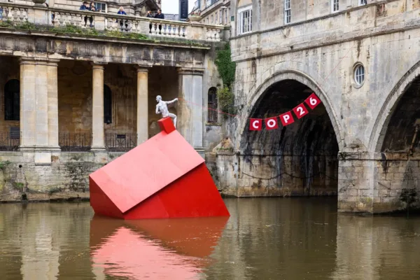
Robert, I’d like to ask you about ‘Sinking House’. This was a key moment for Stride Treglown. How did you pull it off and what was the response?
Robert
We were doing something called a ‘climate action relay’, which served as a build-up to COP 26. We have nine offices in the UK, and we decided that each of them would have “Owner Week” during which they would give talks and presentations, engaging with others in the construction industry.
I'm based in our Bath Studio, and I wanted to do something that went beyond just talking about the issue. There's already too much talk about it. We aimed to convey the message about the climate emergency in a different way, one that wouldn't involve the same people discussing the same themes. Instead, we wanted to reach a much wider audience. So, we reached out to a company called Format Engineers, known for their amazing installations at the Burning Man festival in the United States. They're based in Bath and were eager to collaborate.
We brainstormed what would have the most significant impact and spread the message most effectively. We decided to choose the most iconic location in Bath, in front of a beautiful old bridge, Pulteney Bridge. To make it even more noticeable, we thought about placing something in the river as well. That's when we conceived the idea of floating a red house, which symbolised an emergency. It also provided a striking contrast with the colour of the Bath stone behind it.
On top of the red house, there was a figure created by a local sculptor, Anna Gillespie, clinging to a lifeline rope. The message was a direct reference to Greta Thunberg's ‘Our house is on fire’ speech. It also drew from the context of that summer when there were severe floods in Europe, and people were literally stranded on the roofs of their homes. The rope that the figure held spelled out "COP 26", sending a message to political leaders that this was our last chance.
The message was clear and understandable to anyone, from children to adults. It said to politicians and leaders “Our life is in your hands”. Within days of installing it, the response was overwhelming. It gained media coverage worldwide, and thousands of people in Bath came to see it. It was visually striking and unexpected, especially since it was placed in the river. We had expected opposition in getting the idea off the ground, but once we had a few key supporters, it became easier to gain more support.
It was a journey marked by relentless optimism, where every step we took was like crossing another bridge, and eventually, we surprised ourselves by making it happen.
Conleth
I’m probably showing my ignorance here, but I don’t think of Bath as a particularly progressive city. Was it difficult winning over the council?
Robert
Yeah, I think that's everyone's view of Bath, but it is quite a progressive city. I mean, it's pretty much always been Liberal Democrat, and it has quite a creative vibe to it. The vice-leader of the council is the head of climate change, so getting her on board early on had quite a lot of influence on many of her colleagues. This perception is probably because Bath is a historic city, but it's also a design city. Due to its amazing and beautiful setting, it has always attracted artists, architects, and landscape architects. So, there's always been an appetite for design. Even when you think back to Georgian times, the idea of the Royal Crescent and the way it was designed was revolutionary for its time. It was one of the first planned cities, and including all that green space was quite cutting edge. I suppose there might be just a slight feeling that there are pockets of people in Bath who still want to do something a bit radical.
Conleth
Justine, could you give us an example of your work and how you use colour to transform spaces?
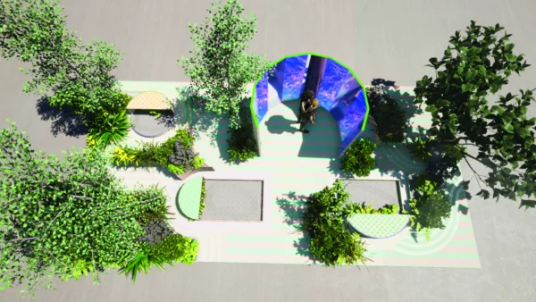
Justine
Holdron’s Green, a sustainable wellbeing garden designed by Campbell Cadey for the Peckham Festival, transformed an industrial space on a tight budget. The architects approached me to unify the space through colour, aiming for a cohesive and inviting atmosphere.
The goal was to make the space visible and versatile, accommodating socialising and quiet activities. I started with a red colour, drawing attention and creating contrast. A soft plaster pink was placed at the outer edges for a calm area, complemented by a deep terracotta. Higher-energy colours like poppy and mandarin were concentrated centrally to engage visitors and draw attention away from exits.
Each colour was carefully chosen to enhance the harmony with the planting and its natural colour cycle. The focus was on amplifying the hero of the garden—the flora. The project was shortlisted for the Pineapples Awards, recognising its positive impact on urban living and working. This accolade highlights the success of collaborative efforts in cross-disciplinary projects.
Audience
Anthony, your involvement with the Rye word press is an interesting story that is perhaps indicative of the way that you, to use Kerry Lemon's phrase, “enact your power”. You appear to be quite generous with your time and support of creatives. Is your collaboration with Adams of Rye an example of that?
Anthony
Yeah, a bit. I moved down to Rye in Sussex in 2003 with my family. Rye is a kind of unique town. It's like a coastal medieval fortress and has a real kind of independent feel to it. All the businesses are locally owned, apart from Boots. It's just a fantastic little place with lots of literary and famous writer links. When we moved down, I saw a poster for a flower festival, and the type was really nice and well laid out. At the bottom, it said “printed by Adams, Rye.” Adams is on the High Street, a fancy goods shop, newsagents, and toy shop. Inside, there's an amazing workshop with letterpress and wood type from the turn of the century or older. They've held on to the entire collection and still use it for various things. I'm on that list of people who use it now, but you have to wait your turn. If the church needs a small A5 print, you have to wait for them to get it done first. It's like, “I'm going to hold your thousand-edition print run for the village fayre.” It's brilliant.
Audience
In our work we have come across the idea of ‘protopia’ from Kevin Kelly, the futurist and co-founder of Wired magazine. It refers to a society that, rather than solving all its problems (as in a utopia) or falling into dire dysfunction (as in a dystopia), makes incremental progress over a long period of time – so neither wholly positive nor negative. I wonder what the panel think of that idea.
Robert
We’ve noticed a lot of talk about regenerative design recently, which is an interesting new angle on ‘sustainability’. Which, when you really think about it, is quite a negative idea; keeping things as they are or not quite as bad, basically doing ‘less bad’. Increasingly there is more discussion about how we can have a positive impact, and that's really encouraging for me.
Justine
I think sustainability would be an easier conversation to have if it wasn’t always rendered in dark, dystopian colours. Regenerative futures feel like a much easier and uplifting concept to engage with. There are great opportunities open to us in change, and the manner with which we communicate that is fundamental to our success. If it were a colour communication I would like to say, “Yes, our future is not pink, fluffy clouds but nor does it need to be dark, flame-filled ravines.” Thanks to our guests for their contributions to the conversation.
We'll conclude where we started with the assertion that design is, fundamentally, an act of optimism; and, when done well and with empathy, can absolutely drive positive change.
NEWSLETTER
Get the latest news and updates sent straight to your inbox.


Meet the team: Domhnall McLaughlin
10th Jun 2026


Meet the team: Jade Whiteside
24th Apr 2026


Hearing the Eyes of the Skin
23rd Mar 2026

ReCover: designing for change, not waste
17th Feb 2026

Under the Table with Glenn Howells
16th Jan 2026

Solus celebrates 30 years
11th Dec 2025

Under the Table with Ian Simpson of SimpsonHaugh
22nd Oct 2025


Meet the team: Luke Bajic, Specialist Product Consultant
29th Sept 2025


Under the Table with Simon Allford
29th May 2025


Staples: What's on this Clerkenwell Design Week
23rd Apr 2025


Meet the team: Aaron Taylor, London Area Sales Manager
30th Jan 2025

Meet the team: Lauren Riley, London Area Sales Manager
29th Jan 2025


Goodbye to 2024
17th Dec 2024


Earth: Elements by Florim and Stiff + Trevillion
18th Nov 2024

Spolia longlisted for Dezeen Awards
12th Sept 2024


Clerkenwell Design Week 2024 – The Aftermath
30th May 2024

What’s on this Clerkenwell Design Week 2024
23rd Apr 2024

The story of the Ceramophone
23rd Feb 2024

Building Minds: In conversation with Frank Bruno
17th Jan 2024


In conversation with Juhani Pallasmaa
2nd Nov 2023


Solus Clerkenwell reopens its doors
31st Jul 2023


In conversation with Roger Tyrrell
21st Jun 2023

Clerkenwell Design Week 2023
31st May 2023


What’s on this Clerkenwell Design Week 2023
24th Apr 2023

In conversation with Mauro Mazzi, CEO of Mirage
17th Apr 2023


How do materials shape positive experiences?
6th Oct 2022


How can the design industry lead with purpose?
13th Jul 2022

Solus sponsors Birmingham charity walkathon
7th Jul 2022

Meet Ken Graham, Sustainability Manager
23rd May 2022


Artisanal ceramics take centre stage for CDW Unlocked
22nd Jun 2021


Solus celebrates 25 years
16th Mar 2020
